Letter Together: Day One
August 16th, 2014, 6pm
It was 19.4°C with few clouds. The breeze was brisk.
The type designer Matthew Carter is often quoted as saying, “Type is a beautiful collection of letters, not a collection of beautiful letters,” meaning that it’s more important for the letters to function together than to be individually well-drawn. To put it another way, if individual letters are standing out more than others in a body of text, the typeface is not a well-drawn1. While I understand this in theory, when you spend two days drawing a handful of characters it’s hard not to get caught up in the small details that make each character unique. In fact, Letter Together, a workshop taught by Jessica Hische, is a crash course in looking at the details of type. Over the course of two days you do what most of us haven’t done since we first learned how to write, think about how each individual letter is constructed.
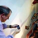
Day one is all analog, paper, pencils, erasers (lots and lots of erasers) with the occasional Sharpie thrown in when a soft pencil is simply not dark enough. The class begins with everyone looking at a typeface for a couple of minutes and then trying to redraw two or three assigned capital letters from memory. Sounds easy, right? Not so much. You’d be surprised what details, both large and small, you end up just not seeing. We’re so used to skating across the surface of words and sentences that we don’t notice the quality of the ice. Is it clear or cloudy? smooth or finely rippled? We only notice it when it breaks and interrupts our smooth forward motion. With the typefaces we used in class there were no such breaks. They are well designed and, since they are text faces, the details are subtle. Nothing flashy like leaves frozen in the ice. So there I am trying to recall and draw something that is designed not to call attention to itself. At the same time I’m wondering if the other eleven people busily sketching away have a better memory or drawing skills than I do. It can be a bit stressful. I did, however, have the advantage of having taken a one day version of this workshop in the past. I was planning on keeping this to myself, but that plan was quickly dashed when Jessica announced that since I was taking the class for the second time, she was switching up the format and making it harder by introducing lowercase letters in addition to the standard uppercase.
By the end of the first day each person has drawn both upper and lowercase versions of their letters. At a certain point the example typeface has been discarded and you’re drawing letters so that they match the ones you’ve already drawn. Each person is working on letters that are uniquely their own. The point of this exercise was not to recreate the original typeface, but to examine the details of letters and make sure that you are consistent with the application of those details within your own group of letters. Day two is all about turning those initial drawings into vector art in Illustrator.
I enjoy classes like this that take me out of my normal work routine and allow me to focus on one particular area of design. My challenge is that often these classes are populated by people in their twenties (and in this case a precocious 13 year old) and I feel that, even though I’ve been doing this for a while, I’m trying to make up for lost time.
-
At least when you’re dealing with text faces. Display type is a whole other story. ↩


Other moments in San Francisco
-
Goodbye, Archives
An invitation to be in the moment
in San Francisco, United States -
Parenting, Life, Work-Life Balance
This morning we decided on a spontaneous trip to Baker Beach with our two-year-old son.
in San Francisco, United States -
Our city by the bay is done with Summer. That summertime fog that we wake up to is no more.
in San Francisco, United States -
Travel, USA, Friends
Homeward bound after a month in the USA
in San Francisco, United States -
Terrorism, Crime, Current Events
One day-One Hour- One Minute- It will happen. It is inevitable. Except it already has.
in San Francisco, United States -
Travel, Cities, Tourism
Top 10 Things To Do In San Francisco
in San Francisco, United States -
Crime, Cities, Tenderloin
If you live in San Francisco, you know to avoid Eddy and Leavenworth Street... *stab*
in San Francisco, United States -
Terrorism, Life
Wrote this the day after the attacks in Paris but was reminded of it this morning when I read the news about the bombing in Turkey
in San Francisco, United States -
technology, The West, Immigration
In Search of Color
in San Francisco, United States